Hi Friends 👋,
Welcome To Infinitbility! ❤️
Today, we will learn to change the color of mui icon ( material icons ) with installation steps also an example of custom color, custom HEX color, and custom RGB color.
Want list of all material icons, Click Here.
Let’s start today’s tutorial How to change material icon color in react?
Table Of Content
- Installation
- Example of using material icon
- Example of color material icon
- Example of custom color
- Example of custom HEX color
- Example of custom RGB color
- Combined examples with output
Okay, now we know what we are going to do let’s start with Installation.
Installation
Install material package ( MUI )
- For NPM developers
npm install @mui/material @emotion/react @emotion/styled
- For Yarn developers
yarn add @mui/material @emotion/react @emotion/styled
Install material icon package
- For NPM developers
npm install @mui/icons-material
- For Yarn developers
yarn add @mui/icons-material
Example of use material icon
We have installed material icons in our react.js project, now we have to import some sample icons from the package and use it in a component.
Here, we are using an example of a delete icon.
import * as React from 'react';
import Grid from '@mui/material/Grid';
import Typography from '@mui/material/Typography';
import DeleteIcon from '@mui/icons-material/Delete';

export default function SvgMaterialIcons() {
  return (
    <Grid container sx={{ color: 'text.primary', width: '50%', margin: 'auto', marginTop: '50px' }}>
      <Grid item xs={6}>
        <Typography>Default</Typography>
      </Grid>
      <Grid item xs={6}>
        <DeleteIcon />
      </Grid>
    </Grid>
  );
}
Example of color material icon
MUI provides its own defined colors like primary, secondary, etc. to color in the material icon.
let’s see how we can able do that in material icons.
import * as React from 'react';
import Grid from '@mui/material/Grid';
import Typography from '@mui/material/Typography';
import DeleteIcon from '@mui/icons-material/Delete';

export default function SvgMaterialIcons() {
  return (
    <Grid container sx={{ color: 'text.primary', width: '50%', margin: 'auto', marginTop: '50px' }}>
      <Grid item xs={6}>
        <Typography>Primary</Typography>
      </Grid>
      <Grid item xs={6}>
        <DeleteIcon color="primary" />
      </Grid>
      <Grid item xs={6}>
        <Typography>Secondary</Typography>
      </Grid>
      <Grid item xs={6}>
        <DeleteIcon color="secondary" />
      </Grid>
      <Grid item xs={6}>
        <Typography>Success</Typography>
      </Grid>
      <Grid item xs={6}>
        <DeleteIcon color="success" />
      </Grid>
      <Grid item xs={6}>
        <Typography>Action</Typography>
      </Grid>
      <Grid item xs={6}>
        <DeleteIcon color="action" />
      </Grid>
      <Grid item xs={6}>
        <Typography>Disabled</Typography>
      </Grid>
      <Grid item xs={6}>
        <DeleteIcon color="disabled" />
      </Grid>
      <Grid item xs={6}>
        <Typography>Custom Color</Typography>
      </Grid>
    </Grid>
  );
}
Example of custom color
Here, we will see how we can use custom colors name like pink, blue, etc.
import * as React from 'react';
import Grid from '@mui/material/Grid';
import Typography from '@mui/material/Typography';
import DeleteIcon from '@mui/icons-material/Delete';

export default function SvgMaterialIcons() {
  return (
    <Grid container sx={{ color: 'text.primary', width: '50%', margin: 'auto', marginTop: '50px' }}>
      <Grid item xs={6}>
        <Typography>Custom Color</Typography>
      </Grid>
      <Grid item xs={6}>
        <DeleteIcon sx={{ color: 'pink' }} />
      </Grid>
    </Grid>
  );
}
Example of custom HEX color
Generally, everyone use HEX color let’s see how can we use in our material icon.
import * as React from 'react';
import Grid from '@mui/material/Grid';
import Typography from '@mui/material/Typography';
import DeleteIcon from '@mui/icons-material/Delete';

export default function SvgMaterialIcons() {
  return (
    <Grid container sx={{ color: 'text.primary', width: '50%', margin: 'auto', marginTop: '50px' }}>
      <Grid item xs={6}>
        <Typography>Custom Hex Color</Typography>
      </Grid>
      <Grid item xs={6}>
        <DeleteIcon sx={{ color: '#af7834' }} />
      </Grid>
    </Grid>
  );
}
Example of custom RGB color
The RGB color is one of the most used color combinations, let’s see how can we apply to material icons.
import * as React from 'react';
import Grid from '@mui/material/Grid';
import Typography from '@mui/material/Typography';
import DeleteIcon from '@mui/icons-material/Delete';

export default function SvgMaterialIcons() {
  return (
    <Grid container sx={{ color: 'text.primary', width: '50%', margin: 'auto', marginTop: '50px' }}>
      <Grid item xs={6}>
        <Typography>Custom RGB Color</Typography>
      </Grid>
      <Grid item xs={6}>
        <DeleteIcon sx={{ color: 'rgb(104, 223, 205)' }} />
      </Grid>
    </Grid>
  );
}
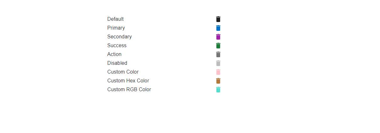
Combined examples with output
Here, we will combine all the above examples in one file and run it in react project.
import * as React from 'react';
import Grid from '@mui/material/Grid';
import Typography from '@mui/material/Typography';
import DeleteIcon from '@mui/icons-material/Delete';

export default function SvgMaterialIcons() {
  return (
    <Grid container sx={{ color: 'text.primary', width: '50%', margin: 'auto', marginTop: '50px' }}>
      <Grid item xs={6}>
        <Typography>Default</Typography>
      </Grid>
      <Grid item xs={6}>
        <DeleteIcon />
      </Grid>
      <Grid item xs={6}>
        <Typography>Primary</Typography>
      </Grid>
      <Grid item xs={6}>
        <DeleteIcon color="primary" />
      </Grid>
      <Grid item xs={6}>
        <Typography>Secondary</Typography>
      </Grid>
      <Grid item xs={6}>
        <DeleteIcon color="secondary" />
      </Grid>
      <Grid item xs={6}>
        <Typography>Success</Typography>
      </Grid>
      <Grid item xs={6}>
        <DeleteIcon color="success" />
      </Grid>
      <Grid item xs={6}>
        <Typography>Action</Typography>
      </Grid>
      <Grid item xs={6}>
        <DeleteIcon color="action" />
      </Grid>
      <Grid item xs={6}>
        <Typography>Disabled</Typography>
      </Grid>
      <Grid item xs={6}>
        <DeleteIcon color="disabled" />
      </Grid>
      <Grid item xs={6}>
        <Typography>Custom Color</Typography>
      </Grid>
      <Grid item xs={6}>
        <DeleteIcon sx={{ color: 'pink' }} />
      </Grid>
      <Grid item xs={6}>
        <Typography>Custom Hex Color</Typography>
      </Grid>
      <Grid item xs={6}>
        <DeleteIcon sx={{ color: '#af7834' }} />
      </Grid>
      <Grid item xs={6}>
        <Typography>Custom RGB Color</Typography>
      </Grid>
      <Grid item xs={6}>
        <DeleteIcon sx={{ color: 'rgb(104, 223, 205)' }} />
      </Grid>
    </Grid>
  );
}
Output
when you run the above code, you will get the output of all mentioned color icons. let’s see the output.
All the best 👍.